CSS has several properties that you can use for aligning elements on web pages.
You can align the text inside the block-level elements by setting the text-align property.
Example:
h1 {
    text-align: center;
}
p {
    text-align: left;
}You can refer to the tutorial on CSS Text to learn more about text formatting.
The CSS margin property's most important implication is the center alignment of a block-level element. For example, by setting the left and right margins to auto, you can align the <div> container horizontally center.
Example :
div {
    width: 50%;
    margin: 0 auto;
}
The style rules in the abovementioned example center align the <div> element horizontally.
Note: Unless you specify a <!DOCTYPE>, the value auto for the margin property will not work in Internet Explorer 8 and earlier versions.
In conjunction with the top, bottom, left, and right properties, the CSS position can be used to align elements with respect to the viewport of a document or containing parent element.
Example:
.up {
    position: absolute;
    top: 0;
}
.down {
    position: absolute;
    bottom: 0;
}
You can refer to the tutorial on CSS positioning to learn more about positioning elements.
By using the float CSS property, you can align an element to the left or right of its containing block so that other content may flow along its side.
Hence, the content will flow along its right side if an element is floated to the left. Conversely, the content will flow along its left side if the element is floated to the right.
Example :
div {
    width: 200px;
    float: left;
}
The most confusing thing about working with float-based layouts is the collapsing parent. Here, the parent element doesn't stretch up automatically to accommodate the floated elements. Although this isn't always obvious if the parent doesn't contain any visually noticeable background or borders, it is crucial to be aware of and must be dealt with to prevent strange layout and cross-browser problems. See the example below:
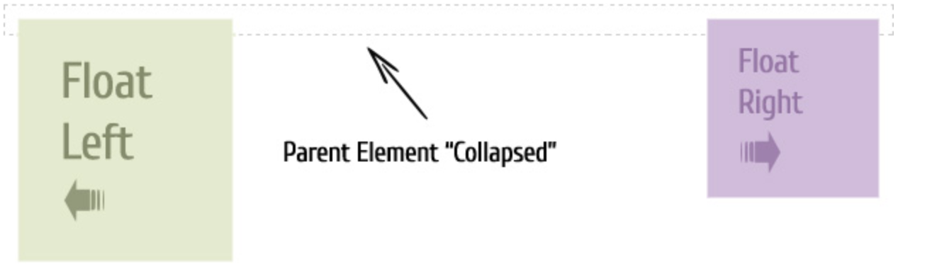
Here the <div> element doesn't stretch up automatically for accommodating the floated images. To fix this problem, you can clear the float after the floated elements in the container but before the container element's closing tag.
You can fix the CSS collapsing parent issue in several ways. The following section describes these solutions along with live examples.
By floating the containing parent element, you can easily fix this problem.
Example:
.container {
    float: left;
    background: #f2f2f2;
}Warning: However, this fix will only work in a limited number of circumstances because floating the parent may produce unexpected results.
Though old-fashioned, it is an easy solution and works across every browser.
Example:
<!DOCTYPE html>
<html lang="en">
<head>
<meta charset="utf-8">
<title>Example of clearing floats</title>
<style>
    .container{
        background: yellow;
        border: 1px solid #c4884d;
    }
    .clearfix {
        clear: both;
        visibility: hidden;
        height: 0;
    }
    p {
        width: 200px;
        margin: 10px;
        padding: 10px;
    }
    .red {
        float: left;
        background: #ff0000;
    }
    .green {
        float: right;
        background: #00ff00;
    }
</style>
</head>
<body>
    <div class="container">
        <p class="red">Floated to left.</p>
        <p class="green">Floated to right.</p>
        <div class="clearfix"> </div>
    </div>
</body>
</html>You can also do this by using a <br> tag. However, it is not recommended method because it adds a nonsemantic code to your markup.
For resolving float-clearing issues, the :after pseudo-element in conjunction with the content property is used quite extensively.
Example:
.clearfix:after {
    content: ".";
    display: block;
    height: 0;
    clear: both;
    visibility: hidden;
}You can apply class .clearfix to any container that has floating children.
Warning: Internet Explorer 7 (IE7) does not support the :after pseudo-element. However, IE8 supports it but requires a <!DOCTYPE> to be declared.