This tutorial helps you learn how to define a border around an element using CSS.
The CSS border properties enable you to define the border area of the box of an element.
Borders appear directly between the margin and padding of an element. The border can either be an image or a predefined style such as a solid line, dotted line, double line, etc.
The section here describes how to set the border's style, color, and width.
You can use the border-style property to set the style of a box's border, such as solid, dotted, etc. The border-style property is a shorthand property to set the line style for all four sides of the border of the element.
It can have the following values: none, hidden, dotted, solid, dashed, double, outset, inset, ridge, and groove. Consider the following example; it helps you understand the differences between the border style types.
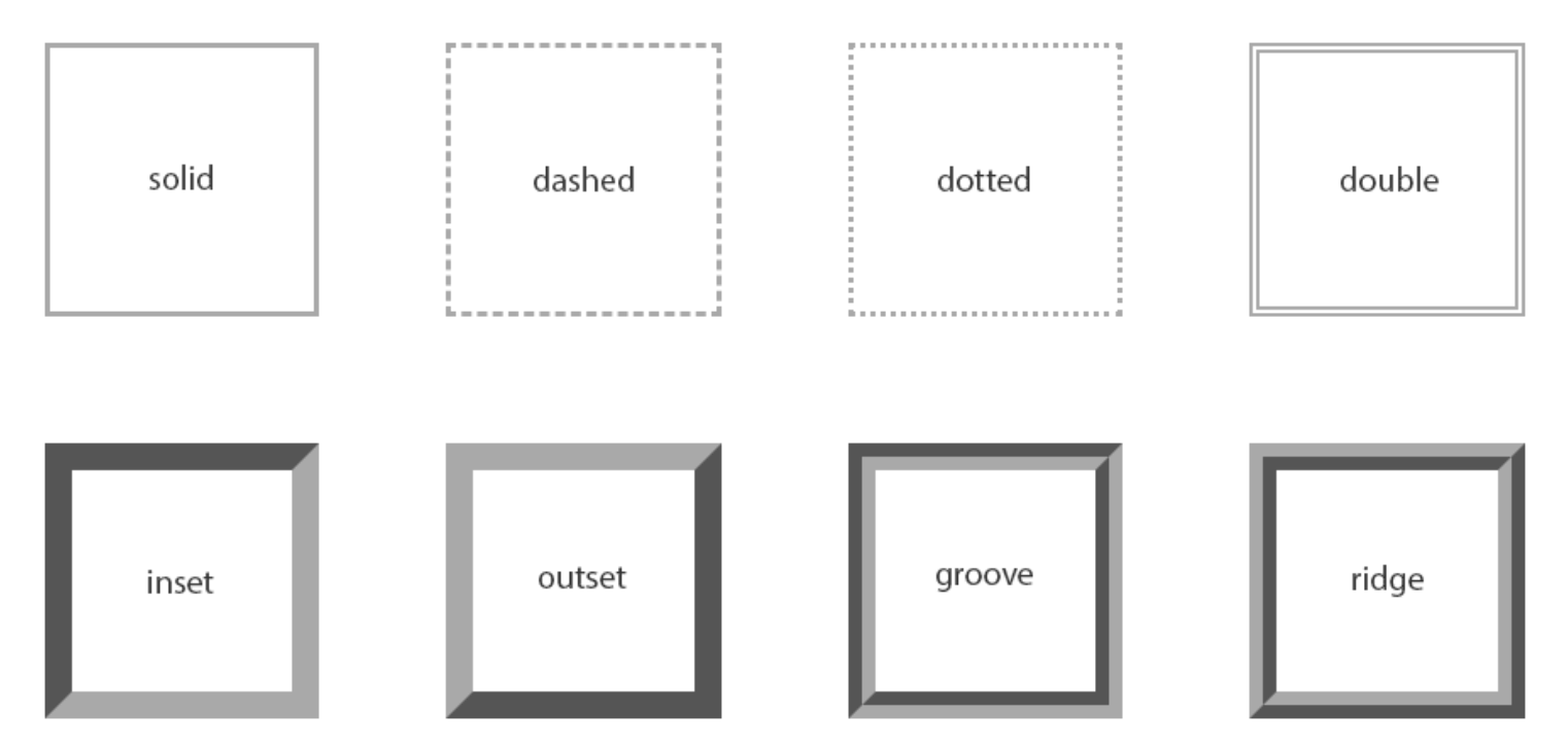
Although no border is displayed when the values are none and hidden, however, there is a slight difference between these two values. The none value has the lowest priority in the case of table cell and border collapsing. In contrast, the hidden value has the highest priority if any other conflicting border is set.
The values inset, outset, groove, and ridge create a 3D-like effect that depends on the border-color value. This is usually achieved by creating a "shadow" from two colors that are slightly lighter and darker than the border color. Let's take an example:
Example :
h1 {
    border-style: dotted;
}
p {
    border-style: ridge;
}
Note: If you want a border to appear around an element, you must specify a border style because the default border style is none. By default, the border color is the same as the text color, and the default border width or thickness is medium.
You can specify the width of the border area by using the border-width property. It is a shorthand property to simultaneously set the thickness of all four sides of an element's border.
Let's take the following example for understanding how it works:
Example:
p {
    border-style: dashed;
    border-width: 10px;
}
Tip: You can specify the border width by using any length value, such as px, em, rem, etc. In addition to length units, you can specify the border width by using one of the three keywords: thin, medium, and thick. Here, percentage values are not allowed.
You can use the border-color property to specify the border area's color. It is also a shorthand property to set the color of all the four sides of an element's border.
The style rules given below add a red color solid border around the paragraphs.
Example :
p {
    border-style: solid;
    border-color: #ff0000;
}
Note: The CSS border-width or border-color property does not work when used alone. You should use the border-style property to set the border's style first.
The border CSS property is a shorthand property to set one or more of the individual border properties such as border-width, border-style, and border-color in a single rule.
Let's take the following example to see how it works:
Example :
p {
    border: 5px solid #00ff00;
}
In case the value for an individual border property is omitted or not specified while specifying the border shorthand property, then, in that case, the default value for that property will be used, if any.
For example, suppose the value for the border-color property is not specified or missing when setting the border, then the color property of the element will be used as the value for the border color.
In the below-mentioned example, the border will be a solid red line of 5 pixels in width:
Example :
p {
    color: red;
    border: 5px solid;
}
But, when it comes to border-style, omitting the value will cause no border to show at all because this property's default value is none. So, in the example below, there will be no border:
Example :
p {
    border: 5px #00ff00;
}